When a client is indecisive and asks for a few design options, it's your job to be able to articulate to that client why you went with a particular layout, including branding, font set, color chips, or visual style. These mockups were created in Photoshop.
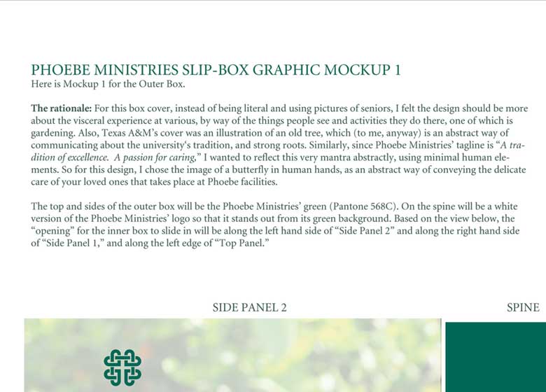
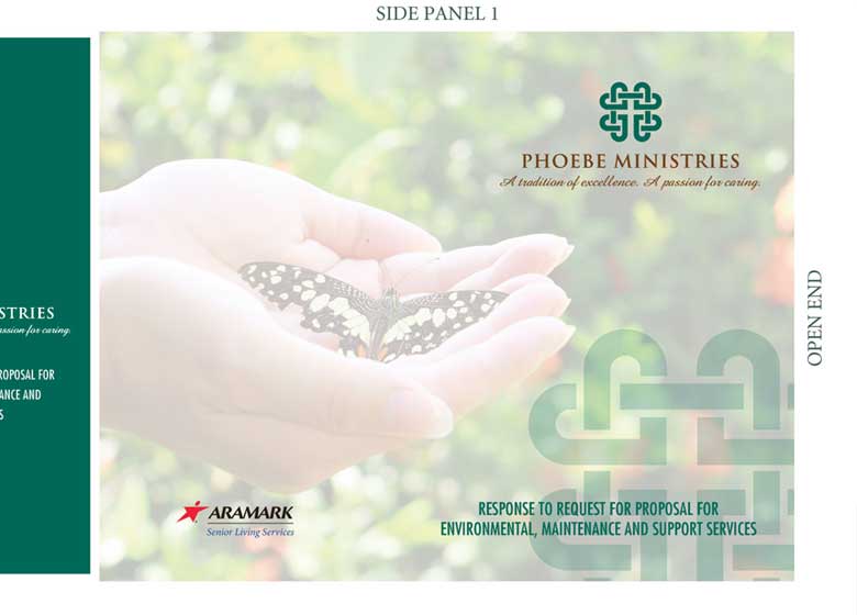
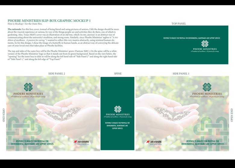
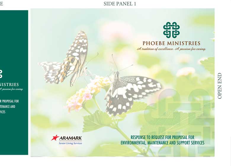
Screens 1-3: Phoebe Box Mockup 1
Per the design rationale on Screen 1, I went with a gardening and butterfly theme to convey the kind of care Phoebe Ministries (a multi-site Senior Living community with Pennsylvania headquarters) provides.
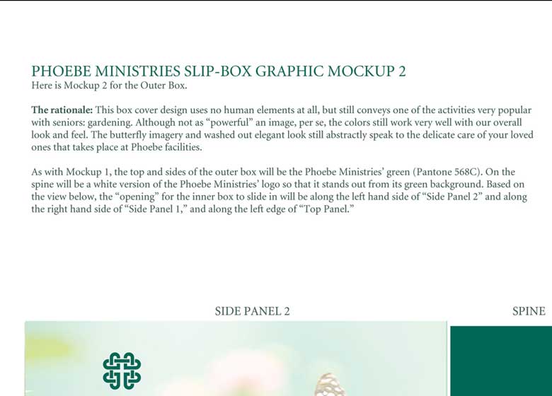
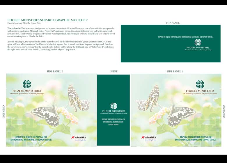
Screens 4-6: Phoebe Box Mockup 2
The second trio of images is essentially the same as Mockup 1, but with a different image the client wanted to try.
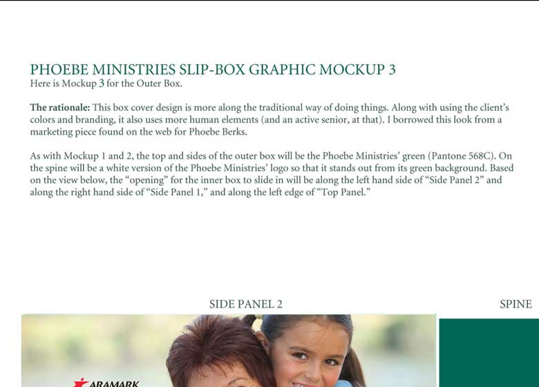
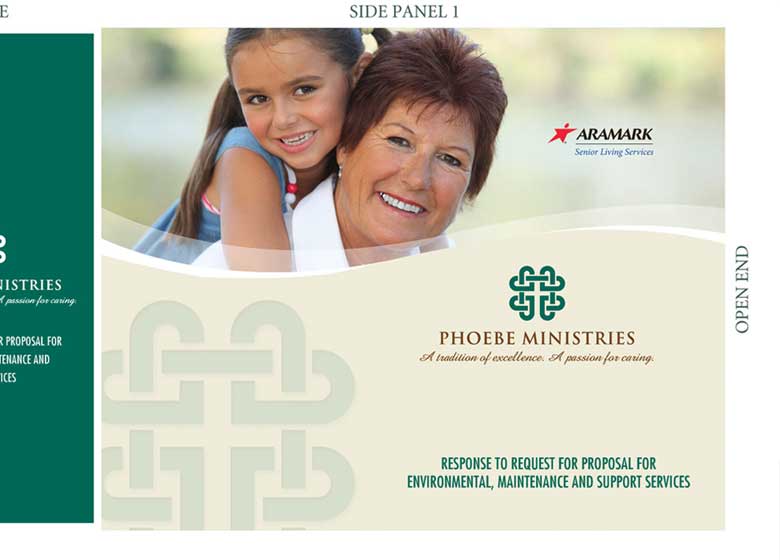
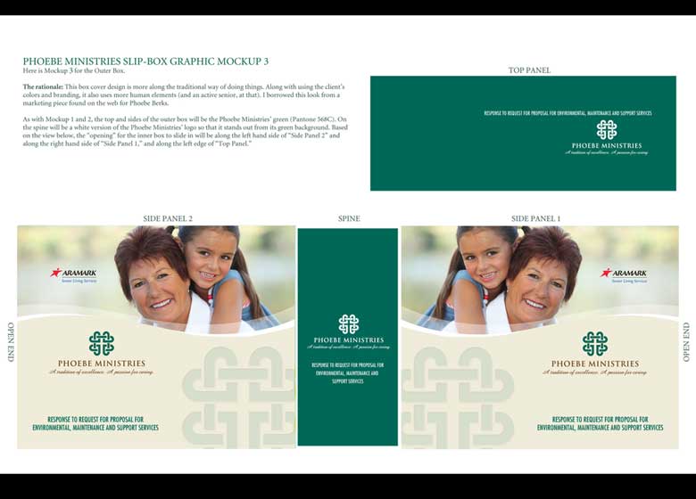
Screens 7-9: Phoebe Box Mockup 3
For Mockup 3, I played it a little more safe, and went with a non-ethereal, more "corporate" look for senior living. This is the design the client ultimately settled on and thus was the one produced for the proposal.